
A logo is an image that serves as the face of your business. They have unarguably become a part of our everyday life. We see them almost everywhere with each striving to get our attention. However, are you aware that there are different types of logos available, and you need to consider just the right one for your business?
As a creative designer, I often get request from clients to create a logo for them, who do not have any particular type in mind. Once the client discloses his logo needs, they will sometimes just refer to a captivating logo that they have in mind as a reference for their needs without considering its type. Each of the different logo types available are better suited for some things than others.
In this post, I will like to shed some light with regards to some of the various types of logos that you should consider for your business.
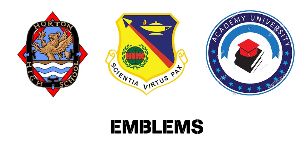
1. Emblems
When you think of emblems, think of those school logos. Starting this list, they are at the forefront of the types of logos as they are the oldest form of logos. These special symbols have been in existence since the middle ages if not even before. The basic description of an emblem is a symbol with texts in it.
Also known as seals or crests, they are often used by government agencies and schools. One major reason for their use here is due to the official look that they tend to give the audience. They are usually much more detailed than other logotypes with detailed imagery.
While the major cons of an emblem lie in its scaling (they do not make a great favicon when scaled down), you should consider an emblem when you need to show some dignity and seriousness in your business. They are also a good way of showing longevity as well as a sense of tradition.
2. Monograms (Lettermark logos)
Think of all those logos with just initials. Yes! These are monogram logos. They are usually used by famous business with quite lengthy names who have taken to making use of their initials for brand identification.
With monogram, simplicity is the order of the day. By employing the use of just the initials of the company name, it helps to streamline the company’s brand and makes it even much easier to remember. For instance, would it have been easier recalling “International Business Machines” compared to the popular IBM?
Since monogram is completely made up of the company’s initials, the font and typography used to implement one become very important. These should be carefully selected to reflect what the company or business stands for. Monograms are quite common with fashion brands such as Gucci, Louis Vuitton, etc.
If you are a relatively new business, the use of a monogram logo might limit the exposure of your company’s real name. You can achieve something creative by adding the full name of your business below the logo. Monograms are also particularly great when you want to tie your visual identity with your name (which is very long). Lastly, industries, where shortening of names is a regular, should consider the use of one. A good example is a law firm.

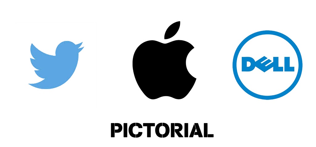
3. Pictorial marks (Abstract logo)
In this type of logo, a graphics-based design (in form of an icon) is used. It is the common form of an image that we picture when we think about the word “logo”. Think of the famous Instagram logo and tech giants Apple. With just a glance at these pictorial marks, you already know what they stand for.
Pictorial marks are great when do not want to be constrained by letter representation. One of the biggest challenges that you can face with pictorial marks is deciding on the type of image that you will like to use. You should create an image that will tie the company’s existence with its values.
Pictorial marks can be a bit tricky to use by new businesses that are yet to establish strong brand recognition. There is a need for you to consider the broader implication of the image that you will like to adopt. Are you trying to imply something deep with the image or evoke emotion with the image?
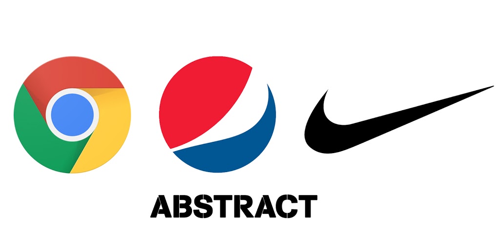
4. Abstract logo
This type of logo can be considered as a subset of the pictorial logo. However, in place of the use of a recognizable symbol, abstract geometric forms are used to create the logo. Can you think of any popular abstract logo? There are quite a number of popular ones around. Among them are the popular Pepsi logo and Adidas logos. Just like other logos, they help you to integrate your brand’s value into a single image. However, instead of being constrained by the use of recognizable images, abstract gives you the flexibility to try out different patterns.
Before making use of an abstract logo, there is a need for you to first establish the kind of emotions that you are trying to create in your audience before developing an image. The image has to convey these feelings and emotions to all your target audience. It is however perfect for businesses that want something that is truly unique.
5. Logotypes (wordmark)
Logotypes are designed based on the words that make up the name of the company, business or product. This is just perfect for tying the name of the company to its visual identity. Since this type of logo is based entirely on the letters that make up the name of the company, there is much concern on the typography here. There is a need for you to choose or create your font carefully.
The font type, shape, colour and style all play their part in creating the logo and how the audience perceives it. A popular example of logotype is the search engine giant Google’s logo. The different colours used to represent the different result that you should expect when searching on Google and also the diversity of their products.
Logotypes are particularly recommended when you are a new company and want to give your brand name a lot of exposure. You should also consider them if your name is short enough and not long. If it is long, a good alternative is a monogram as discussed earlier. You should, however, note that with logotypes, there is a need for you to update your logo since fonts follow trends.

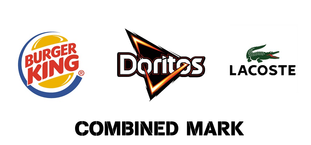
6. Combination mark
As its name implies, the combination mark combines the advantages of logotypes or monograms and pictorial or abstract logos. The texts and images are creatively merged into one so as to create something unique. Can you think about some of the prominent companies that use combination marks? Dove, Doritos, and Lacoste are great examples that you might have come across.
Since this type of logo integrates both texts and images, it is a versatile choice that works together so as to reinforce your brand. For new business, it helps your audience identify the image with your business name in a short while. You can easily decide to make do with only the symbol over time when the connection has been well established in your audience’s mind.
Since combining a symbol and a text creates a unique image, they are usually much easier to trademark than only a pictorial mark alone or wordmark. If your brand is focused on simplicity, making use of combination mark might be a little bit complicated and look too busy for your brand. However, if you will like to enjoy the advantage of both worlds (wordmark and pictorial), combination marks are just perfect.
Bottom Line
The one simple rule to the design of logos is that there are no simple rules to logo design. Hopefully, the above types of logos will guide your choice of logo depending on your company’s values.
Keep it in mind that getting a suitable logo is one of the most interesting parts of starting a business. Hire a professional creative designer and get the perfect visual identity for your business.