
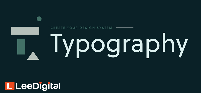
Typography is undoubtedly one of the most important components of graphics design. Regardless of your experience as a designer, it is always a good idea to keep your mind refreshed about the principles of typography. Learning things such as the origin of a font will further enrich the meaning of your design.
Just like any other skill or trade out there, there is need for you to learn specific rules and guidelines to become an expert of your skill set. Lee Digital brings you some of the 7 most important principles of the art of typography.
1. Start with the basics.
Most beginners in design often think that typography is a straightforward practice. However, in the actual sense, typography is complex due to its combination of science and art.
Understanding the nitty-gritty of the art of typography is one of the things you need to start off with. A typeface consists of specific measurements, vocabulary, and specifications that should be taken into consideration. You can always pull off breaking a rule only if you understand the typeface by heart. This can also be accepted only when you carry it out on purpose to create something unique and significant.
In order to better understand the basics of typography, you should spend some quality time learning and studying the art.
2. Note font communication.
The art of merely scanning through your font catalogue for a font you personally like seldom yields an efficient result. Selection of a typeface is not a random process. This is especially due to the psychology that is linked to certain typefaces.
When creating a design, you should ensure that your type is actually connecting with the target audience. This goes beyond ensuring that your copy is perfectly written. You should ensure that your font choice fits perfectly into your market. A good way of illustrating this is designing a corporate body’s brochure with a rainbow-colored font. That would be a disaster, as this is more suited to something fun and for kids. This font will be better suited for a birthday invite.
3. Kerning
Kerning refers to the act of fine-tuning the space between characters. While this does not sound too important, a well done kerning job makes all the difference. The main goal of kerning is to ensure that the space between characters are aesthetically even to create an appealing text.
While software like Adobe Photoshop can assist with your kerning blunders, there is need for you to understand your kerning when working with logos and headlines. Longer texts can usually go unnoticed.
4. Reduce your Fonts
One mistake that newbie designers make is to make use of different fonts and styles in a single design. They often get overwhelmed by the number of options of different fonts that are available to them. If at all you will be needing more than a single font, then you should make sure that it does not exceed three typefaces. Different fonts can be employed for the header, subhead, and body.
You should also be careful not to use varying similar fonts which might be easily passed as a mistake on your part. Employ the use of fonts from different typeface families if you need more than a single font.
5. Work on your Alignment
Alignment is no doubt an important concept when it comes to typography. A lot of non-designers tend to go for Justified and Centre alignment which can make the paragraph hard to read. There is a high chance that you have worked with Microsoft word if you are reading this, then you will also be familiar with its four key alignment options: Centre alignment, right alignment, left alignment, and justified alignment.
Left alignment is the most common as it is easy on the eyes. Right alignment also works well when done properly. As a designer, stay away from Justified!
6. Pick a perfect secondary front
To augment the readability of your design, font pairing is important. When you have a text with a heading and subheading, employ the use of different typefaces which complements each other to establish visual hierarchy. When adopting font pairing, you need to be very careful not to use two contradictory fonts or similar fonts.
7. Readability comes first
No matter how fascinating your design can be, it remains useless if your audience cannot get the message you are trying to pass. This implies that you should ensure high contrast in your choice of colour and avoid using small fonts over high contrast image.
Bottom Line
There is a need for you to constantly practice and sharpen your skills. You can never over practice. Through constant practice, these rules and guidelines stick with you and assist you in creating great typography. So we’ll be leaving you with these words “Keep practicing until you can comfortably break these rules”.